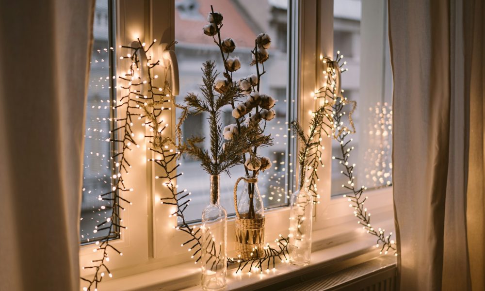
The holidays often bring visions of red ribbons, green garlands, and glittering ornaments, but modern décor trends invite a broader palette. Color can still feel seasonal without relying on the same combinations seen every year. From cool tones that mirror winter mornings to bold hues that energize a room, reimagining festive design allows for a more personalized and balanced approach.
Refreshing décor doesn’t require a full redesign. Small changes (such as switching out textiles, adjusting lighting, or adding new accessories) can transform a room’s atmosphere. Updating elements like washable rugs and tablecloths makes it easy to experiment with new color palettes while keeping cleanup simple.
These seven alternatives to red and green bring warmth, charm, and individuality to holiday spaces that feel timeless yet new.
1. Winter Neutrals: Soft Whites, Creams, and Taupe
Soft neutrals create an understated yet inviting seasonal aesthetic. Instead of vivid colors, these tones rely on texture and warmth to create spaces that feel cozy and balanced. Combining shades of ivory, cream, and taupe adds depth without overwhelming the eye, making this palette ideal for minimalist or Scandinavian-inspired interiors.
Natural materials such as linen, wool, or jute complement these colors beautifully, while warm lighting helps prevent the space from feeling cold or stark. The neutral palette also serves as a perfect backdrop for metallic or wooden accents, which add subtle sophistication. Winter neutrals work particularly well for those who prefer a calm, serene environment that still feels festive and refined.
2. Frosted Blues and Silvers: Cool and Contemporary
For a crisp, modern take on seasonal décor, frosted blues and silvers evoke the calm of a winter morning. The cool tones provide an elegant foundation that pairs easily with glass ornaments, metallic finishes, or mirrored surfaces. Together, these elements reflect light, making your space feel open and bright.
This palette complements both traditional and contemporary homes. In modern interiors, silver accents enhance clean lines and minimal layouts. In more classic spaces, soft blue textiles or ornaments bring a refreshing update to existing décor. Frosted blues and silvers work especially well in open living areas or dining rooms by adding a touch of sophistication that’s both subtle and festive.
3. Deep Burgundy and Blush: Warm Yet Sophisticated
Deep burgundy, paired with blush tones, introduces richness without relying on traditional red. The combination feels romantic and balanced, offering both depth and lightness. Burgundy adds warmth and structure, while blush provides a soft, complementary contrast.
Velvet, suede, or matte finishes bring out the best in these shades, creating tactile interest. Metallic gold or rose gold accessories further elevate the look, adding a sense of luxury that remains approachable.
This palette is particularly suited for spaces designed to feel intimate, such as dining areas or sitting rooms. It creates a warm, inviting environment that transitions smoothly from holiday gatherings to everyday living after the season ends.
4. Forest Green and Gold: Earthy and Refined
Forest green offers a sophisticated alternative to bright holiday green, pairing beautifully with gold for an elevated, nature-inspired design. The combination feels timeless and organic, grounding a space while maintaining festive appeal.
Natural greenery, wooden accents, and brass fixtures enhance the earthy character of this palette. It’s ideal for those who want their décor to feel both seasonal and sustainable. This pairing works equally well in rustic cabins and modern homes, offering flexibility across styles. The muted tone of forest green also makes it suitable for year-round décor, so that the effort put into decorating continues to pay off beyond the holidays.
5. Plum and Midnight Blue: Moody and Luxurious
For those drawn to rich, dramatic colors, plum and midnight blue create a striking and contemporary palette. These deep jewel tones add dimension and a sense of intimacy to living spaces. When paired with lighter neutrals or metallic details, they add a sophisticated depth that feels both elegant and contemporary.
Plush fabrics, such as velvet or chenille, enhance the luxurious nature of these shades. Layering with soft lighting or gold accents softens the intensity while maintaining a polished aesthetic. This combination is ideal for formal entertaining areas, where a sense of drama and refinement can elevate the seasonal atmosphere. Plum and midnight blue deliver a fresh, confident alternative to traditional red-and-green décor.
6. Mustard and Charcoal: Modern and Unexpected
If you want a contemporary twist on winter style, mustard and charcoal create an appealing balance between warmth and contrast. Mustard’s golden tone brings energy, while charcoal offers grounding sophistication. Together, they form a palette that feels both modern and adaptable to various home styles.
Celebrate in Colorful Simplicity
Holiday décor is best when based on creativity and comfort rather than convention. Moving beyond red and green opens new possibilities for expressing personality through design. Each of these six palettes presents an opportunity to create a home that feels intentional, welcoming, and uniquely festive.